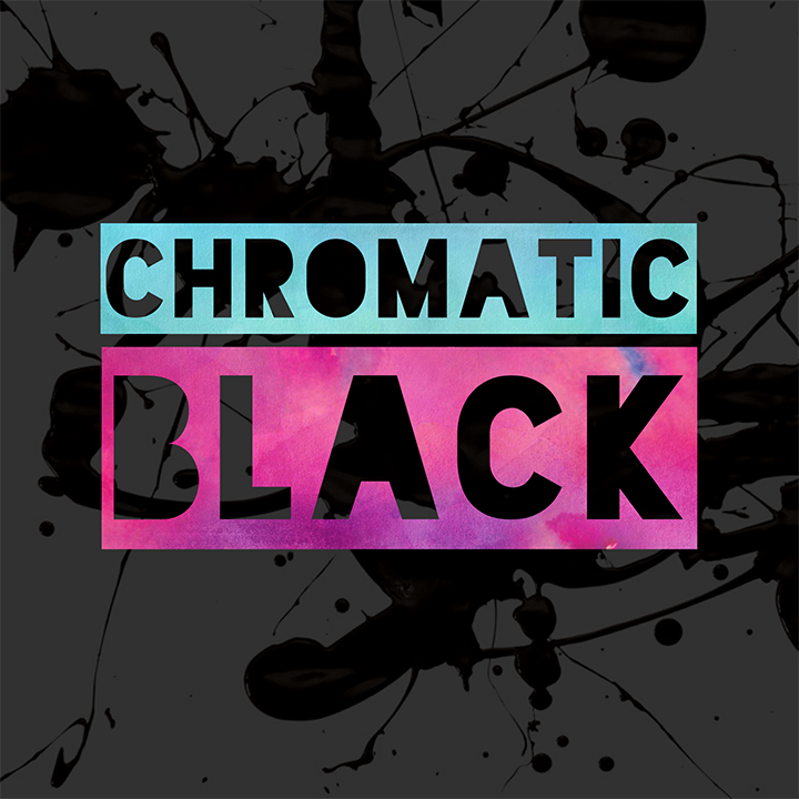
Art

  • ✨ Chromatic Black ✨


    Black oil paint is usually made from dark, but lifeless, carbon or iron oxide pigments. When one of these standard black paints is mixed with white, it creates relatively flat, lifeless shades of gray. 😐 When it’s time to darken a color mixture, standard black paint is said to “kill” the color. 😮

    Because of this, there are many painters who avoid standard black paints altogether and opt instead to MIX their own versions of black using COLOR. 🌈💥Then, when that freshly-mixed ‘black’ paint is put to work, the resulting mixtures have inherent energy and depth—and don’t fall flat.

    [Of course, there have been some AMAZING painters who fully embraced classic black paints—Zorn, Sargent, and Sorolla, to name a few. 💫]

    Black paint mixed from intense, beautiful colors is called “Chromatic Black.”

    There are numerous approaches that lead to lovely black paint mixtures. Usually, a mixture will center on two dark complementary colors. 💙🍊 For instance, one common approach is to mix Ultramarine Blue with an earth color like Burnt Umber or Burnt Sienna. In such a case, if the mixture is too cool, a little more earth color is added. If it is too warm, a little more blue is added.

    Also note that when a custom-mixed black is made from transparent paints, the resulting black will also have transparent qualities.💧This can come in handy for glazing or for when you want to darken a color while maintaining its transparency.

    There’s no RULE that you must use black paint. 📜 And there’s no RULE that you must avoid black paint. 📜 Instead, there are preferences. Here are a few Chromatic Black paint combos to get your creative wheels spinning, and to start identifying your own preferences when it comes to black paint.


    ⚫ CHROMATIC BLACK ⚫


    • Ultramarine Blue and Burnt Umber
    • Ultramarine Blue and Burnt Sienna
    • Alizarin and Phthalo Green
    • Prussian Blue and Burnt Sienna
    • Phthalo Blue, Quinacridone Magenta, and Hansa Yellow to neutralize
    • Phthalo Green and Quinacridone Red
    • Pyrrole Orange and Phthalo Blue
    • Dioxazine Purple and Light Green Permanent
    • Ultramarine Blue, Pyrrole Red, and Hansa Yellow Medium
    • Ultramarine Blue, Pyrrole Red, and Cadmium Yellow Light

    FYI‚ Gamblin sells a tube of pre-mixed Chromatic Black. I believe it’s made from Phthalo Green and Quinacridone Red.

    Happy Painting. 🌈💥
    xo—Heather 🙂

  • Color Zones of the Face

    Are you ready for greater success with your figurative paintings? 🙋🏻♀️
    Here’s a *SIMPLE concept* that will serve you well throughout your painting career.

    There are THREE general color zones of the face. These three zones can be more prominent in fair-skinned people, and in men. 👨🏼🦰 But, they exist! And, in no time, you’ll start to recognize these subtle differences.

    Speed up that recognition by quickly memorizing this simple three-part concept…


    *****************************

    Let’s get into the zone, and go over the zones!

    Note that I have exaggerated the color overlays in my David photo here in order to help you identify and memorize the basic placements. Of course, there are always exceptions! For instance, lighting can obviously alter how these color zones might appear, as can skin tones. So, keep that in mind.

    Now, use this tip to help you learn to SEE—which invariably will help you learn to PAINT! Successful painting in many ways is successful seeing. 👀

    1. Forehead—Yellow or Whitish

    In the forehead, where the skin is taught across a bony plain and there are fewer capillaries, the area can have a yellowish appearance or even a whitish look at times.

    2. Nose, Cheeks, and Ears—Pink!

    In the nose, cheeks, and ears, where there is more blood flow, these areas are more reddish.

    3. Chin—Greenish or Bluish

    For women and children, the chin area can be greener than other areas of the face. Then, for men, due to facial hair looming just beneath the skin, the chin area is usually bluer.

    *****************************

    Here are a few examples that reveal how master painters capture this phenomenon. Remember, the color differences are subtle—not clowny like my David image shows. My young son thinks I’ve made him look like a giant piece of candy corn!

    Example 1

    Here’s an example where the color zones are prominent and crystal clear: Gilbert Stuart’s portrait of Washington.

    Example 2

    Zoom in on this portrait by Richard Schmid, and you will see that he included a swath of purpley-blue on the chin and a flash of nearly-neon hot pink on the cheek. And, look at how richly-red the ears are!

    Example 3

    Here’s a painting by Ilya Repin where the top zone and the middle zone are clearly delineated. However, the man’s facial hair obscures the chin, so you won’t see such a clear zone at the bottom of his face.

    Example 4

    One more. And this one is SUBTLE! Zoom in on this traditional-style portrait by Sargent. Look closely. Can you see that the forehead is whitish-yellow, the nose, cheeks, and ears are pinker, and the mouth area is grayer? This painting wouldn’t be nearly so effective if the whole face were the same pink of the cheeks or the same yellow of the forehead. On an UNRELATED NOTE, humor me, zoom in on that front eye—and check out the two bright flashes of flame orange at the inner corner of her eye. So much life and liveliness in two thoughtfully-placed dabs!

    *****************************

    Memorize the color zones and look for them. This concept will become one small-but-MIGHTY instrument in your artist’s toolkit.

    There are times when you are painting a face, and it just looks flat. 🤷🏻♀️You’re not sure what will bring it back to life. Then, you rosy up the nose and ears, rouge up the cheeks, blue up the chin a little, then yellow up the forehead every so slightly—and voila, the portrait comes back to life! Yes! 💥

    With that, I’m off to fetch a bowl of Neapolitan ice cream. 🍨

    xo—Heather